
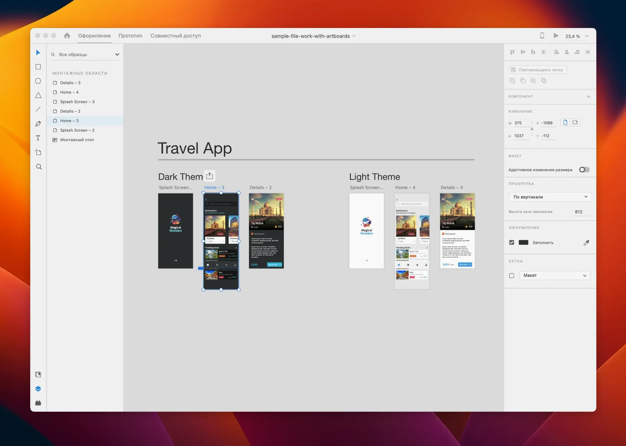
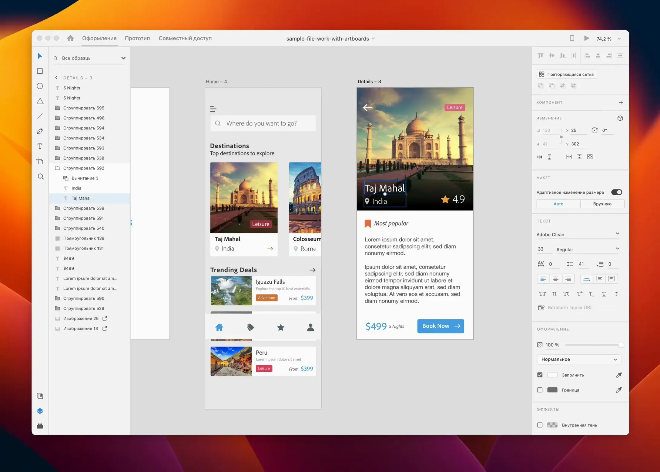
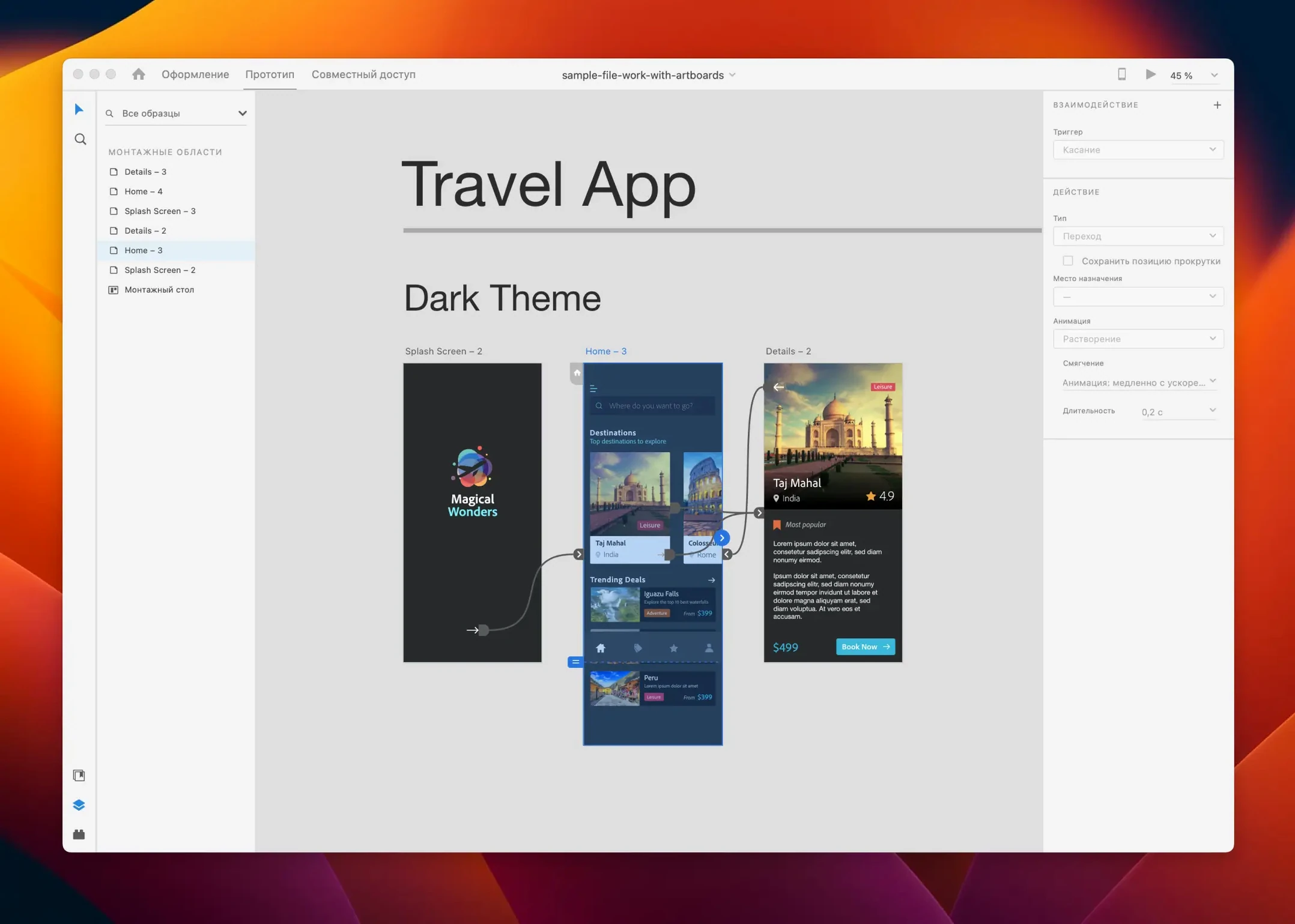
One file format, one pipeline. Adobe XD keeps design and prototype in the same document instead of bouncing between Sketch and InVision.
Copy-paste vectors
XD is a single app that covers wireframes, visual design, and interactive prototypes. It reads your macOS clipboard; you can paste vectors straight into Illustrator if you need to. For teams, shared libraries and linked assets appear without exporting.
Sync vanishes
The sync step. When you adjust a screen, the prototype updates. No separate handoff tool, no re-exporting flows. It also cuts the need for a second app to test on a device — the preview window mirrors to a phone over USB.
Open preferences before you start your first file. Two changes make an immediate difference. Under General, switch nudge amount to 8 px — it aligns to most grid systems in one tap. Then uncheck auto-embed images in Assets; linked images keep your file light and let you batch-replace assets without digging through layers.
Also worth toggling: use shift to constrain. Turn it off. Drawing rectangles and ovals then behaves closer to Illustrator, and you avoid the small muscle-memory fights that slow down the first hour.
Building a landing-page block, end to end
Assume you need a hero section — headline, subtext, CTA button, background image. Start with a desktop artboard at 1440 px wide. Drop a rectangle for the background; fill it from Creative Cloud Libraries if the brand palette lives there.
Switch to Repeat Grid only if you have a row of cards. For a single hero, skip it. Place text layers directly. Hold Option while dragging to duplicate the headline, then scale the copy down for body text. Select both, tap W for the alignment panel, pin them left.
Add a button by drawing a rectangle, rounding its corners to 4 px in the property inspector, and overlaying a text layer. Group them with Cmd+G. In prototype mode, wire the button to a second artboard — set the trigger to Tap, action to Auto-Animate, easing to Ease Out for 0.3 seconds. The preview window confirms the motion instantly.
A morning session
Launch XD and the welcome screen lists recent prototypes. You open the checkout flow you left mid-edit. The artboards are numbered: 01-Cart, 02-Address, 03-Payment.
You notice the address form labels sit too far from their fields. You select all four labels, nudge them 8 px right twice, and the layout snaps back into rhythm. A colleague in the shared prototype comments on the payment screen — the card-number field needs an error state. You duplicate the artboard with Cmd+D, swap the field border to red, add a small warning icon from the CC Library, and wire it as an overlay. Total elapsed time: under ten minutes.
Before lunch, you open the iOS preview on a tethered phone. The tap targets feel right; the auto-animate transition from address to payment glides instead of jumping. You close the lid knowing the prototype matches the screen in your pocket.