


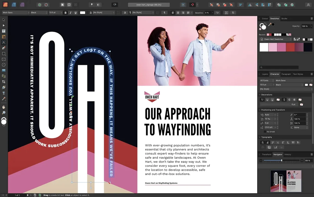
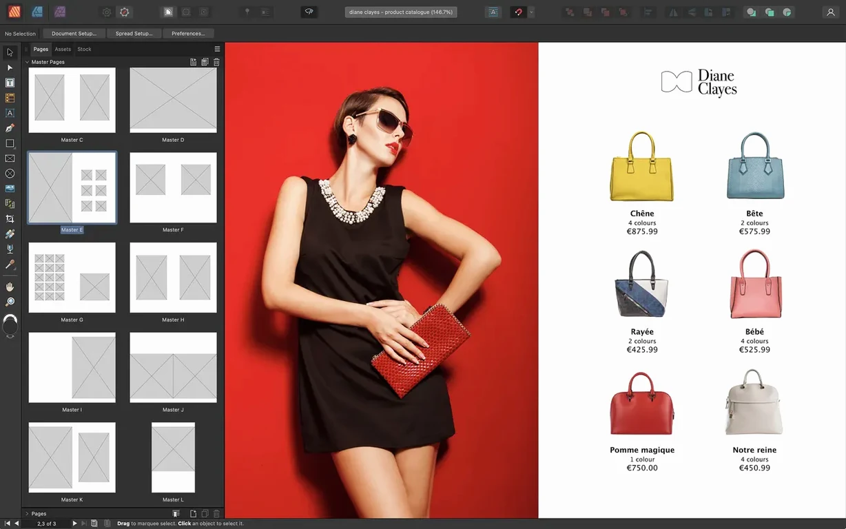
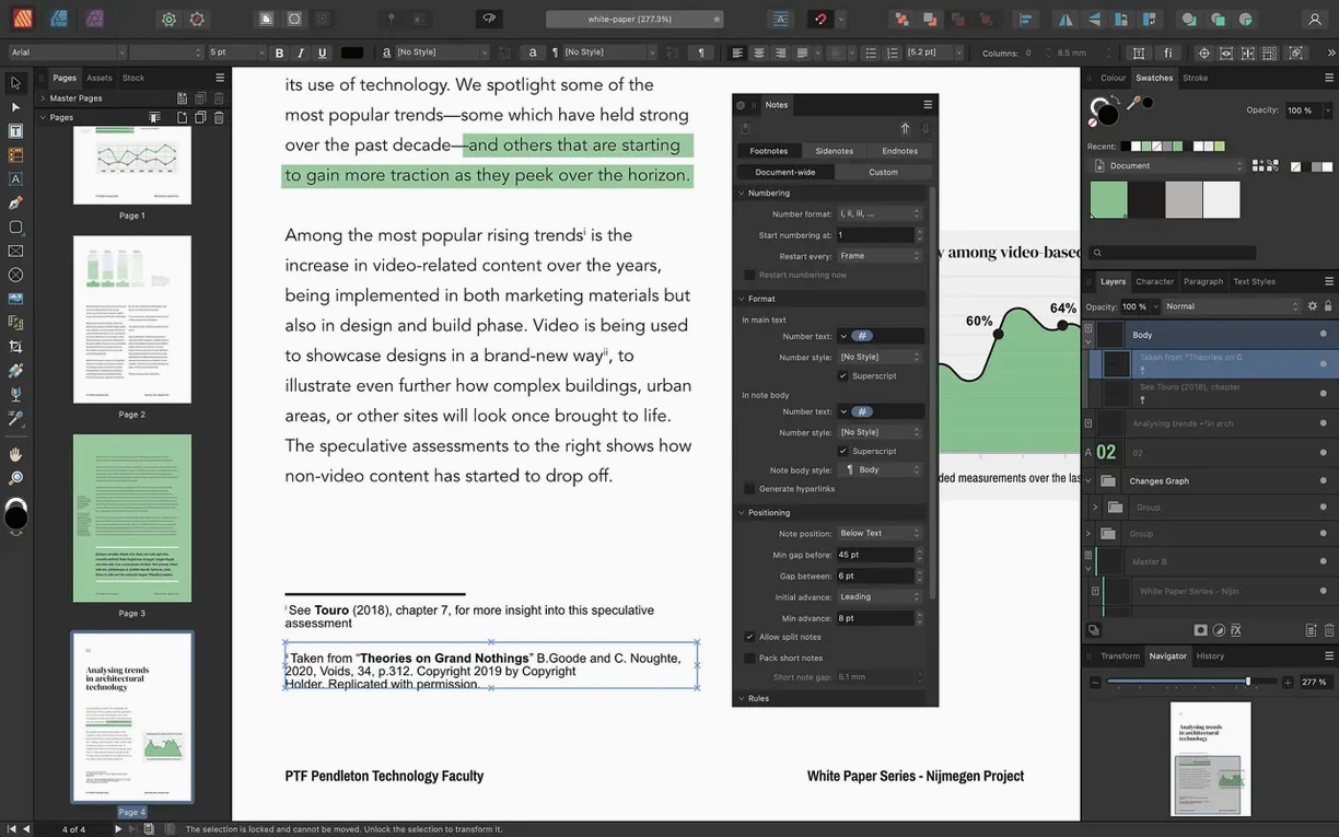
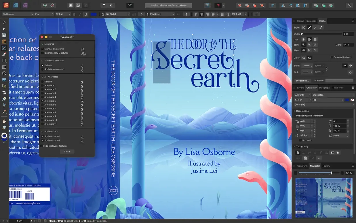
A book designer opens a chapter file. The text needs to breathe around a dropped capital, and a full-bleed image must sit behind it without clipping the footnotes.
1. Place the image, then set its text wrap to a tight contour. Adjust the padding so the serifs never touch the edge.
2. Apply a non-destructive levels adjustment to the image layer directly. No round trip to another app. The original pixels stay untouched.
3. Turn on OpenType stylistic alternates for the body face. The ampersand shifts to its historical form across the entire story.
4. Open the Reading Order panel. Tag the headline, then the pull quote. The export will carry a logical structure for screen readers.
5. Send a PDF/X-4 to the printer. Live transparency remains, and the Pantone spot colors sit on their own plates.
StudioLink blinks in the toolbar. A vector graphic needs an edit, so you switch personas without leaving the page. The spread now holds a gatefold—three panels that fold into the cover. The tools deepen, but the work stays quiet.
Building a zine
Start with a gatefold cover. Set the spread to three panels in the Pages panel. Drop your cover art into the left panel, let it bleed across the fold. The center holds the title in a custom text frame shaped with the Node tool. Right panel: a single pull quote in the display face.
Inside, lay out a six-page interview. Import the transcript from a placed TXT file. It lands as one long story. Draw three linked text frames across the spread—one for the questions, one for the answers, one for the margin notes. Apply your character styles: a heavier weight for the interviewer, a lighter italic for the subject.
Place scanned Polaroids as embedded TIFFs. Add a 0.5pt stroke, a soft shadow through the layer effects panel. No clipping paths needed—the text wrap follows the frame contour. Pull a spot color from the Pantone library for the pull quotes. It repeats across every page through a master page swatch.
Export as PDF/X-4 for the risograph shop. The spot color separates cleanly onto its own plate.
Nested masters
Make one master spread early. Even a blank one with just margins and a page number. Nested masters take longer to learn than they should—try them on a throwaway file first. A child master that inherits from a parent, then overrides just the folio position.
Turn on View > Show Special Characters and leave it on. Invisible breaks in linked frames cause most of the layout puzzles new users hit.
Set your default table formats before you build the first table. The cell style panel rewards early attention. A clean header row format, saved once, applies across the whole document.
Open the Reading Order panel early in a project, not at export time. Tagging a 40-page document in one sitting is tedious. Tag as you build.
StudioLink gain
Book designers who live inside InDesign find the shortest learning curve. The spread management, master pages and style system map closely. They gain StudioLink—switching to vector or photo tools without leaving the layout.
Small-press editors working alone. One person handles the acquisitions, the layout, the cover and the print-ready PDF. Affinity Publisher removes the app-switching that fragments a solo workflow.
Anyone producing long structured documents—technical manuals, catalogs, academic journals with footnotes and running heads. The style inheritance and master page nesting handle complexity without scripting. The Reading Order panel makes PDF accessibility part of the publishing step, not an afterthought.
People searching for an Affinity Publisher torrent often just want to open a complex InDesign file without a subscription. Publisher reads IDML. It is not perfect, but the text frames, styles and image links survive the translation more often than not.