


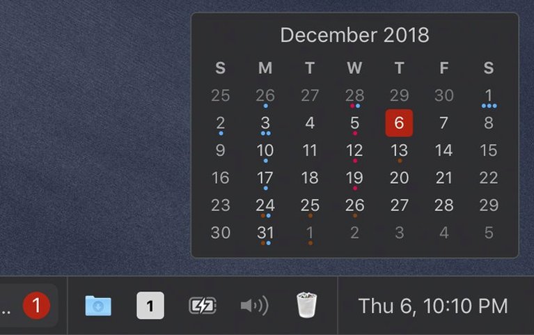
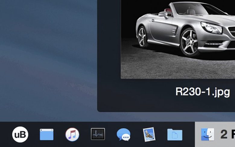
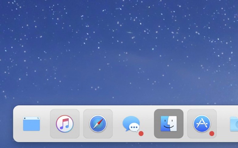
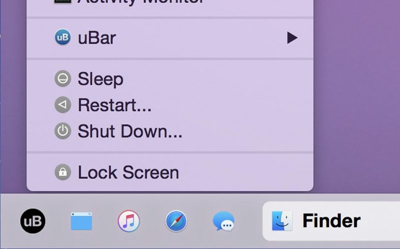
If the Dock feels like it's guessing which windows you need, uBar puts them all in plain sight. It sits where you want it—bottom, side—and lists every open application, not just the ones you've pinned.
Running apps
- Seeing at a glance what's actually running, without hovering or hunting.
- Keeping a multi-row layout when one strip isn't enough.
- Switching themes to match a light or dark desktop.
Dock shift
- It replaces the Dock, so it changes a core habit.
- Positioning takes a moment to get right.
Replaces Dock
People ask whether uBar sits comfortably next to the Dock. It does not. It is a replacement. Once enabled, the Dock disappears. You can bring it back by quitting the app.
Another common concern is window grouping. By default, uBar groups windows by application, but you can split them into individual task buttons. This matters if you keep several Finder windows open and want to jump to one directly instead of cycling through.
The height question comes up often. Five rows is the maximum. Most people settle at two or three. One row for app icons, another for live window titles. It keeps things readable without eating into screen space.
Performance anxiety is fair. Old versions on older hardware could feel sluggish. The current build does not. It stays quiet in the background, even with many windows open. The macos ubar experience now feels native rather than layered on top.
Leak fixed
Version 4.2.5 arrived as a maintenance release. Two fixes stand out. First, a CPU and memory leak tied to the user account photo in the menu icon on macOS 26. Before the patch, that small icon could drag system resources down over a long session. It no longer does.
Second, menu positioning on macOS Tahoe 26.0 was slightly off. Menus appeared a few pixels away from where they belonged. The correction restores the tight alignment that the earlier mac ubar experience relied on. Day-to-day use now feels as precise as it did on previous system versions.
It speaks the same languages your Mac already does—sixteen of them.