

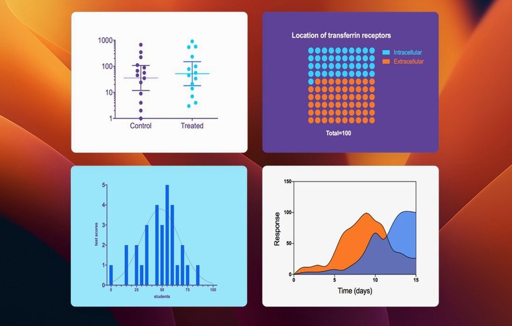
The variable selection pane no longer breaks your train of thought. It moves the way the rest of Prism moves.
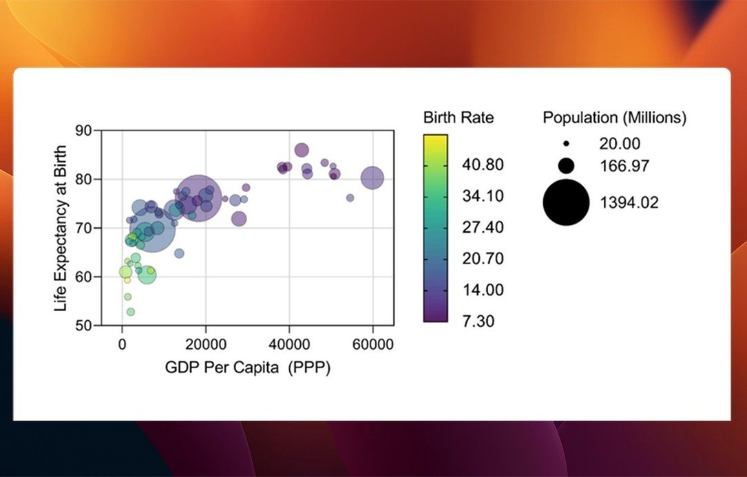
In 11.1.0 that cleaner selection reaches t tests, multifactor ANOVA, nonlinear regression and simple survival analysis. Multiple variables tables get new graph types and their own ordering of categorical levels.
A workflow
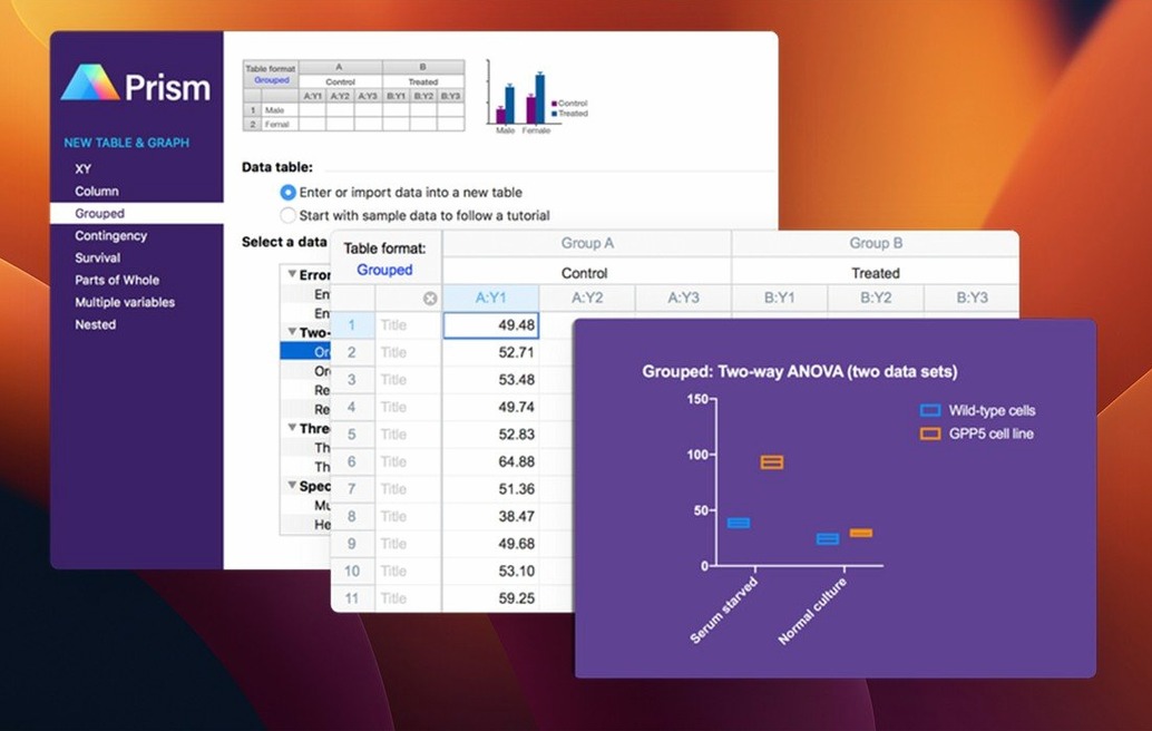
Take a dose-response experiment with two cell lines, three replicates each. Open a Grouped table. Paste your raw values. Prism auto-detects the structure.
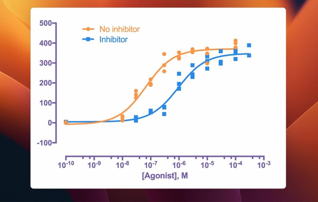
Click Analyze. Choose nonlinear regression from the list — the dialog now shows only the variables you need for that fit. Select log(agonist) vs. response. Confirm. The curve appears on a fresh graph sheet, both cell lines overlaid.
Switch to the results table. Scroll to the EC50 confidence intervals. Copy the values with the clipboard button. Paste into your lab notebook.
Back on the graph, double-click an axis. Set the X-axis label to “log[Drug] (M)”. Adjust the color of the second curve so it reads clearly in grayscale. Export as PDF.
Done. One file, no script, no separate graphing tool.
Wrong Table Trap
Wrong table format. If you paste survival data into a Column table, Prism won’t offer Kaplan-Meier analysis. Use a Survival table instead. The analysis dialog shows only analyses that match the data shape.
Graph looks jagged. The default number of curve points is low. Double-click the curve, raise the number of line segments, and the fit smooths out.
Multiple comparisons confusion. After a one-way ANOVA, the multiple comparisons tab defaults to Tukey. If you need Dunnett’s, switch it before clicking OK — changing it after re-runs the whole analysis.
Export size. A graph exported at 300 dpi with a thick border can balloon. Drop the border width or export at 150 dpi for slides.
From the bench
A pharmacologist runs binding assays. Each plate gives hundreds of wells, grouped by treatment and concentration. She opens Prism, pastes the plate layout into a Grouped table, and clicks Analyze for a one-site binding fit. The Bmax and Kd appear in a linked results sheet. She color-codes the graph by treatment and sends a PDF to her PI before lunch. No export to another program. No code. The only interruption was refilling her coffee.
The rest stays as it was. Prism still helps you choose a test and read the result, and still keeps repeated experiments in order.